Ah, the iconic USC jerseys. Barely changed through decades—a century even.
 But barely means it still gets changed. You may have noticed the colors getting more and more pale. On TV, the jerseys look straight up like someone set the wash cycle a bit too long.
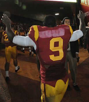
Sure a few shades of color may be hard to get right with different materials. If they want to stick with Nike’s cutting edge designs and materials, slight variation are expected. Where crap crosses the line is the back of the jersey. Starting from the 2013 season, they looked like this:
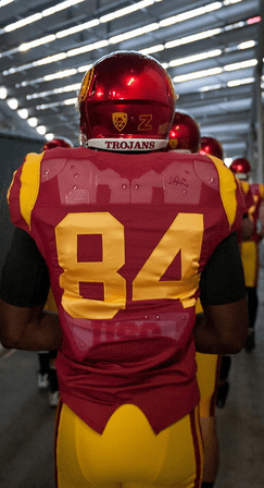
These jerseys didn’t get any better the following season. They added the chrome domes and still had terrible jersey backs.
You can even completely read the USC on the branded back plate. Considering how USC is literally the last FBS program that does not include names on jerseys, I could see how this is pretty low on the priority list for the folks at Nike, though. It’s mostly unnoticable for other schools, but the USC ones hurt to look at for extended periods of time.
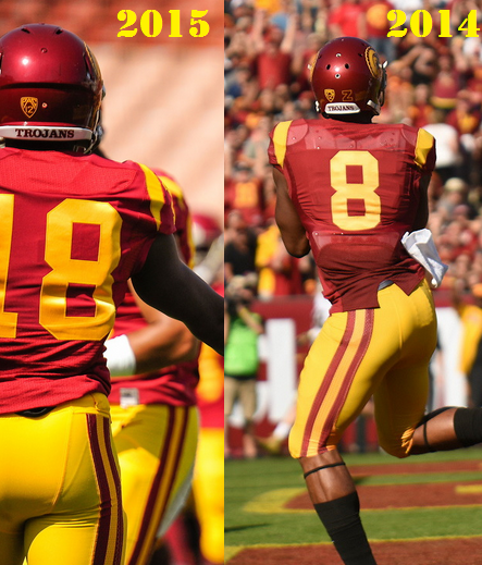
Nonetheless, I am reservedly anticipating an improvement for the 2015 season. Why? While you were all busy trying to see what Town and Browne could do, I was staring at their jerseys. Something definitely looked different. Take a look for yourself:
After seeing the difference, there is only one thing you can say:
Hopefully, Todd Hewitt and his equipment managers have a couple hundred of these in their stockroom for the upcoming season.
CommBro Breaker
None of this will undo this monstrosity:


One comment